
LookSee, Movie Reco's for Heroes, Lovers, and Shadows
Project Goal
To design the first legs of a new product for recommending movies and TV. “First legs” because timing was short, and investor pitches were near. Design enough to build a prototype of an FTU (first time user).
Deliverables
- Wireframes for “Taste Quiz" (based off clients rough balsamiqs)
- Wireframes for “Browse page"
- Brand and identity
- Front end design and spec’s for developer
“What do you want to watch?"
"I dunno, what do you wanna watch?"
An entrepreneur-friend of mine was passionate about trying to solve the popular #streaminglife problem of never being able to decide on something to watch. You sit there scrolling through trays of movies and tv on Netflix, Hulu, Amazon, Vudu, etc - 45 mins is gone before you know it.
Why couldn't someone like Netflix, who has mass amounts of viewing behavior data, deliver a more personalized experience? Why weren’t recommendation algorithms working?
With LookSee, we set out to build an engine and browse experience that could solve this. LookSee was also an opportunity to design an experience and a product from scratch (but very quickly).
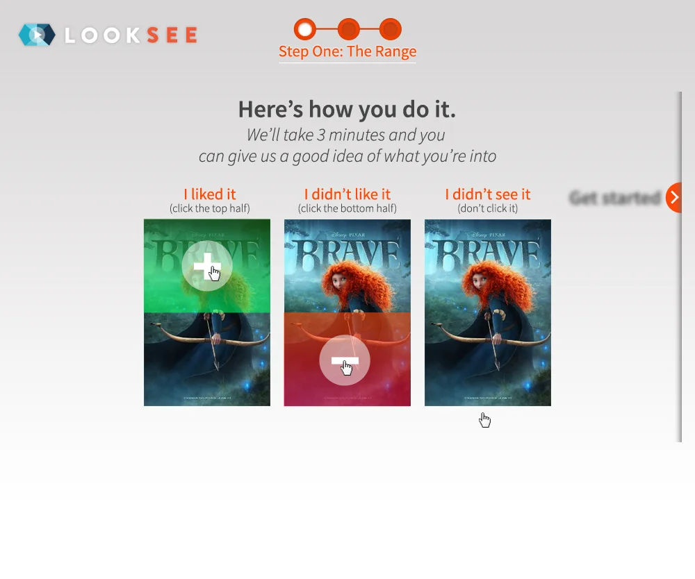
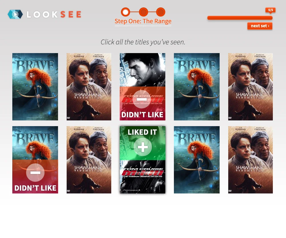
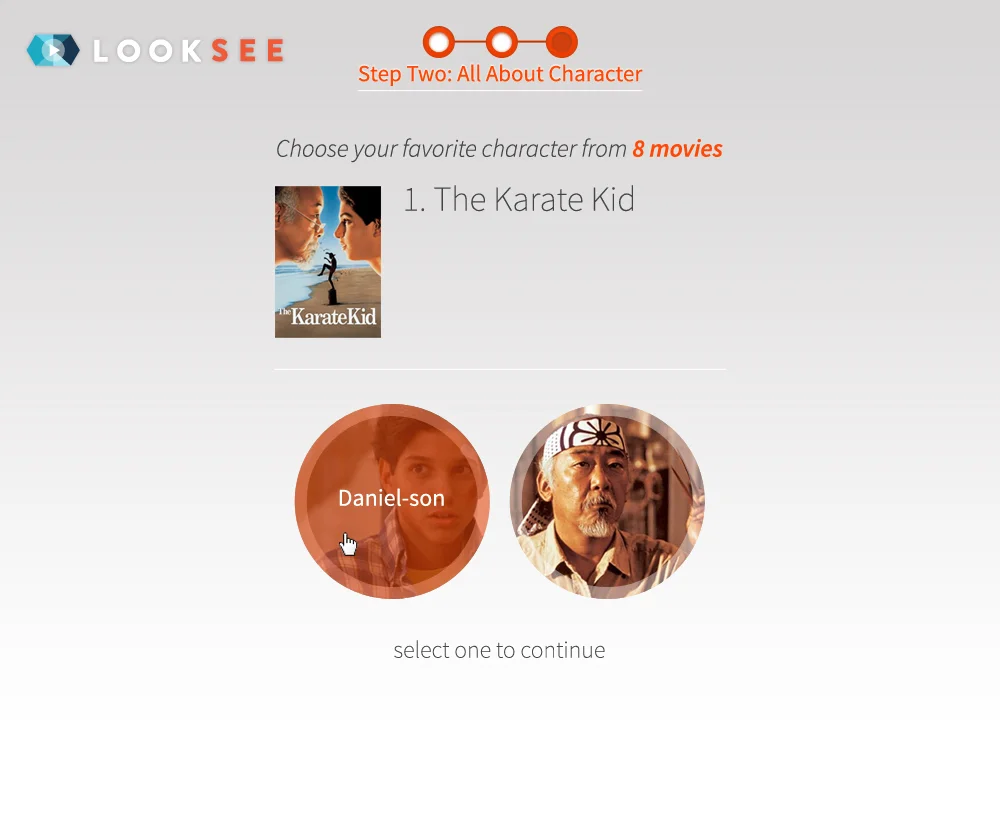
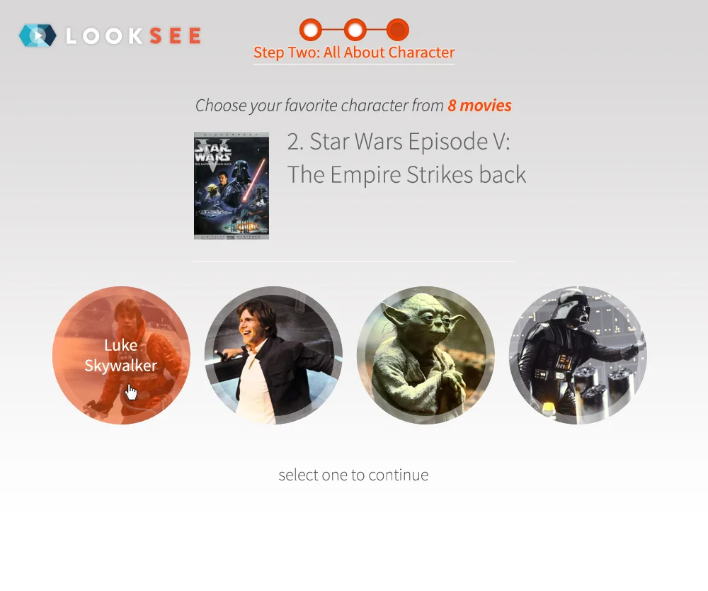
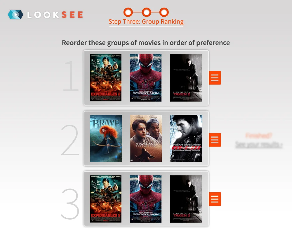
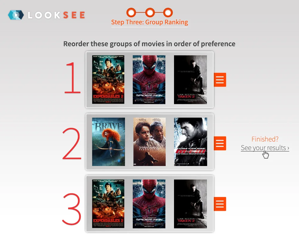
The product would start with an "initial taste profile" that quickly quantifies a user's taste for film and tv. Users would only take a quiz once, and upon completing the quiz's three step process we'd be able to make accurate and relevant recommendations.
The recommendation engine was to be built around the 12 Jungian Archetypes.
Our insights on Archetypes:
Archetypes aren’t just emotional and personality patterns within all of us - they also exist in every character and story we watch on screen.
Applying this to someone’s “taste” is: a) measurable, therefore a brilliant way to predict our connection to content and b) remains consistent.
The 12 Archetypes:

There would be a custom algorithm that graded movies and tv shows with scores on each archetype which would be the defining feature in content recommendation.
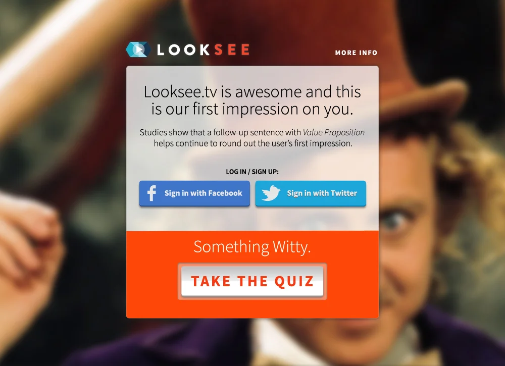
Our goal was to craft an experience that was designed with two things in mind: speed and trust.
Speed:
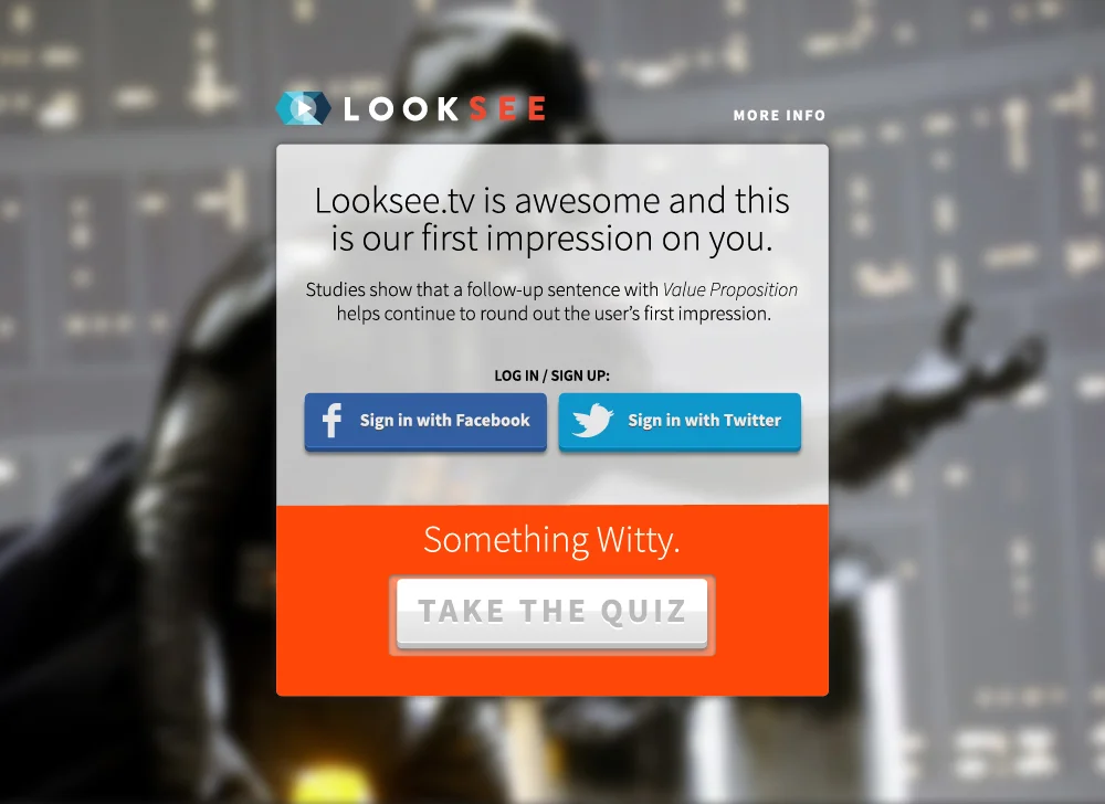
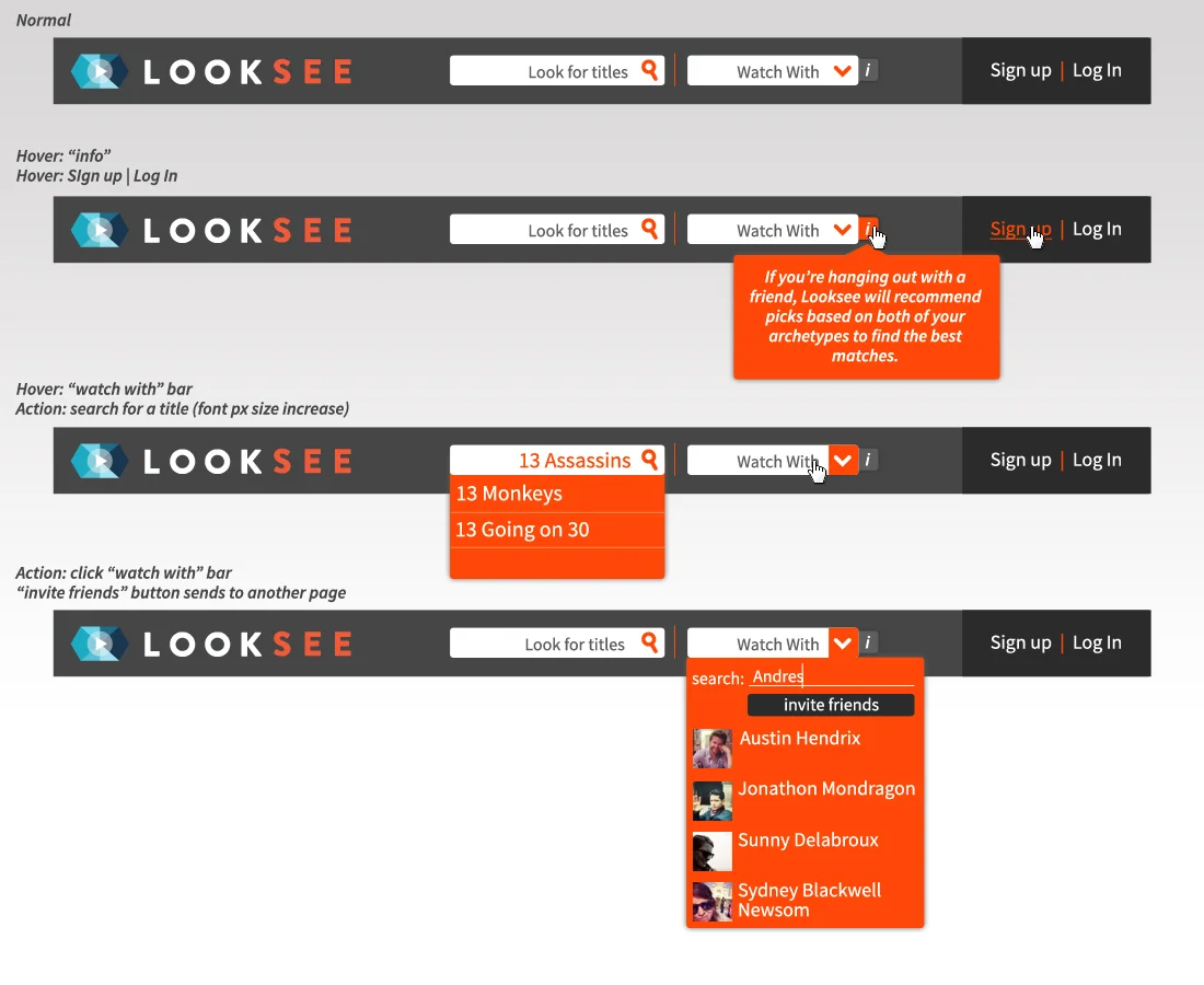
Sign Up: From the seconds a user has landed, they should be allowed to participate with as little friction as possible. This means you could signup with social connect, or email, or neither and continue as a non-subscriber.
Archetype Quiz: had to be engaging enough to feel like it moved quickly. We knew this was going to involve some pretty interactive steps that required a user’s attention, so not only should each of the 3 steps not feel redundant in any way, they need to be intuitive, fun, and have as little impact on cognitive load as possible.
Browsing: If the product was going to continue to learn about your viewing habits and tastes, as well as recommend you content - the design needed to feel intuitive and really help motivate user actions.
Trust:
If we could get you to the results of your quiz, we were very confident that the archetype you were assigned was going to be the first sign of value on the service. Example: Let’s say you were a Pisces. I ask you to describe to me your personality, and without hesitation, I say “Pisces!” with confidence - you’re trust in my ability to know a Pisces as well as other signs would increase (maybe a little, maybe a lot, but increase).
If our algorithm worked, our recommendation engine would begin to save you a lot of time in your browse experience. Each successful serve would increase your trust in our product. This meant the UX+UI's design goals were, first and foremost, to elevate and highlight both the algorithm and the archetype, and their relationship to you.
Brand
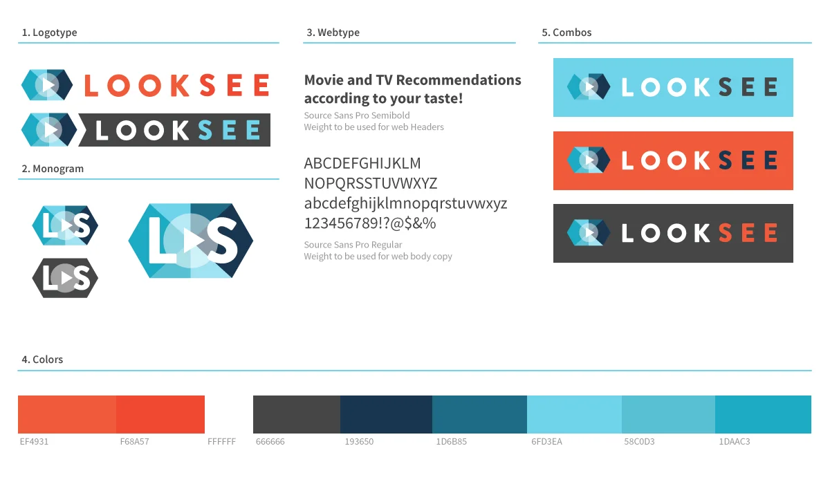
V1
This brand should be extremely readable, bold, but friendly. The edges of the logotype are soft, the colors vibrant, but hip (as opposed to hulu's green or netflix's red).
The logo icon is reminiscent of an eye. The play arrow is now a 100% indication of a streamable piece of video content online and I really wanted to make that part of this branding experience. The shades in the eye represent the idea the LookSee is a product built to deliver recommendations, options, to you. Light, dark, doesn't matter - the recommendation is going to be in your shade of color.
The Quiz
Wireframes


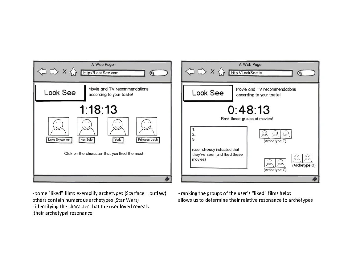
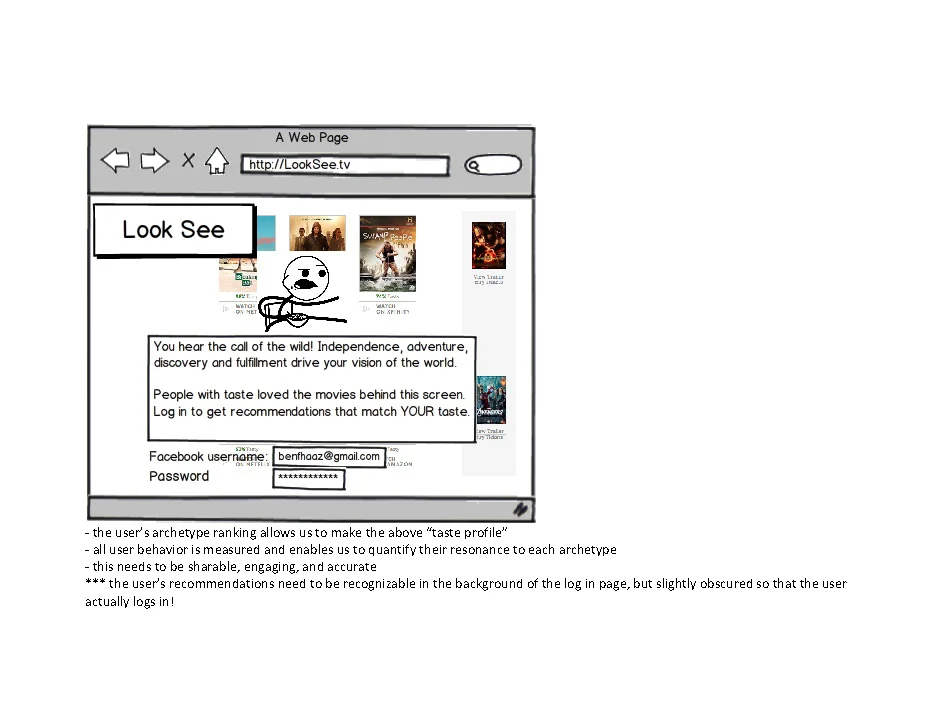
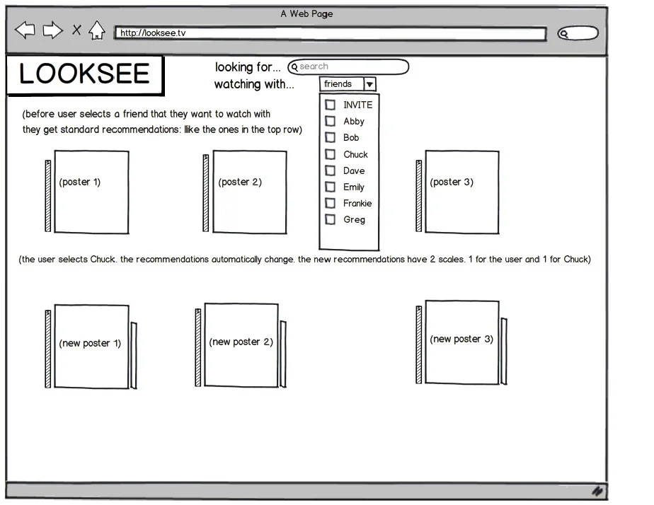
Client's original Balsamiq wireframes. These and a conversation are all I had to work with before I took off and ended up with the above set

Taste Quiz Design

First Browse
Wireframes


Client's original Balsamiq wireframes. These and a conversation are all I had to work with before I took off and ended up with the above set.

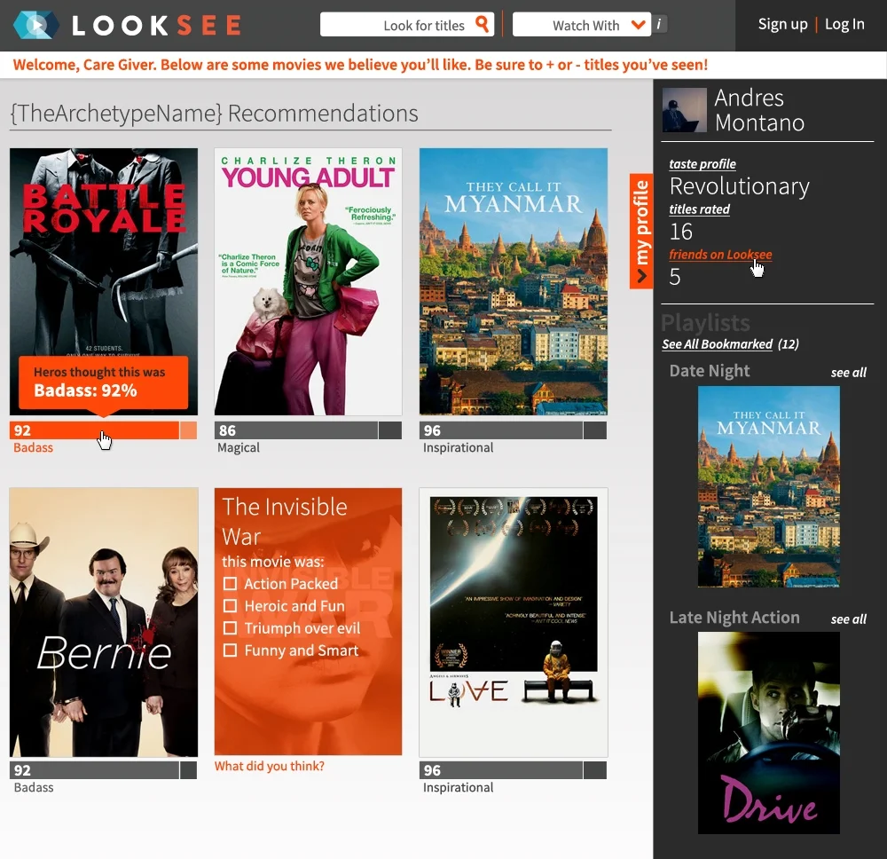
Browse Page Design

Results
LookSee, unfortunately didn't make it past an interactive prototype (which I wasn't able to screen-cap). These first rounds of design and UX were a highly collaborative experience between a developer, the business owner (founder), and myself.
I'm still proud of the interaction modeling that we were able to construct with the initial quiz as well as the overall exploration of trying new interactions on the browse page.


